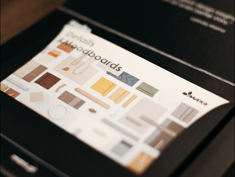
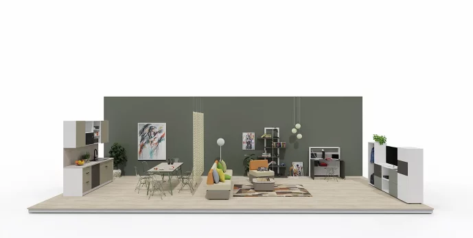
Color zone
Colors determine how we perceive spaces. For MARO Office Furniture this goes without saying. Therefore, we offer our clients products in a variety of shades, materials and fabrics. We design our furniture with utmost care for all visual aspects and that is why its use ensures an original and balanced work environment as well as enhanced employee efficiency and comfort.
Explore the entire range of colors together with MARO!
Want to arrange a modern office from scratch? Don't leave anything to chance. We realize how complex the right choice of colors can seem, therefore we will help you with everything. You don't have to ponder it on your own. We know how to tailor each office zone to your employees' expectations.
See how your space changes right in front of your eyes, forming a harmonious whole. With our help, your office will turn into a place that fosters concentration and pleases your aesthetic taste. We will transform its character and make it unique thanks to diverse colors and materials.
1. Individual work zone
Many people are most comfortable working on their own, yet appreciate the proximity of their colleagues. Such a work mode requires maximum focus. A properly arranged space should provide employees with optimal work conditions. In order not to disrupt concentration, it is worth choosing upholstered acoustic walls, which are designed for open spaces. This way, it is easy to guarantee comfort as well as to improve acoustic conditions of your office. It will be more convenient for the employees to perform their duties once they start using Bench desks with partitions and pedestals for personal belongings.
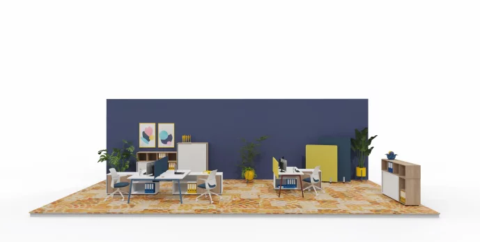
A space that supports energy and creativity can be built on bold yet well-considered color accents. A muted shade of yellow and deep navy add character to the interior and spur action, supporting concentration and creative thinking. Natural wood brings visual balance, and the presence of plants enlivens the space and promotes well-being. Such an arrangement works well in individual work zones, where both energy and comfort matter.

A space that supports energy and creativity can be built on bold yet well-considered color accents. A muted shade of yellow and deep navy add character to the interior and spur action, supporting concentration and creative thinking. Natural wood brings visual balance, and the presence of plants enlivens the space and promotes well-being. Such an arrangement works well in individual work zones, where both energy and comfort matter.
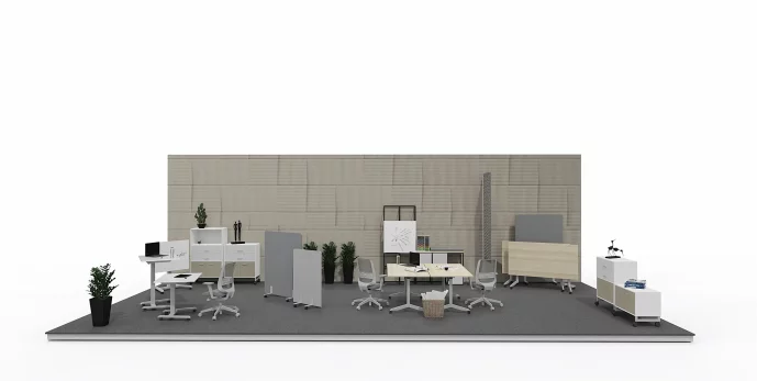
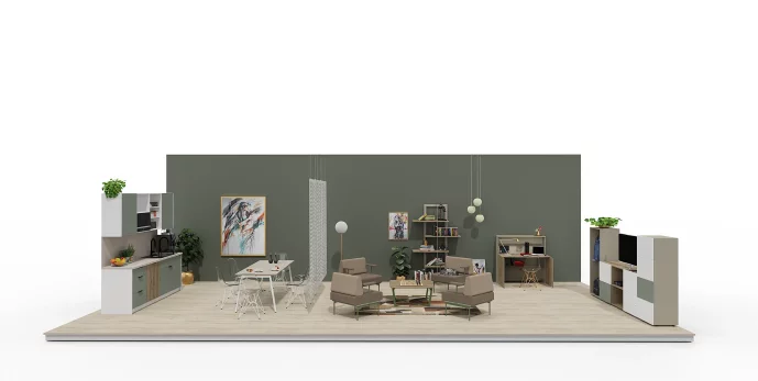
Not every workspace has to be stimulated with intense colors. Sometimes it is the subdued tones that foster focus and inner calm. Shades of gray, graphite, and light wood create a harmonious and elegant composition that does not distract but supports effective work. Additionally, the presence of greenery in the form of plants adds freshness and natural balance—without the need to resort to flashy accents. Such an arrangement helps reduce fatigue and supports everyday concentration.

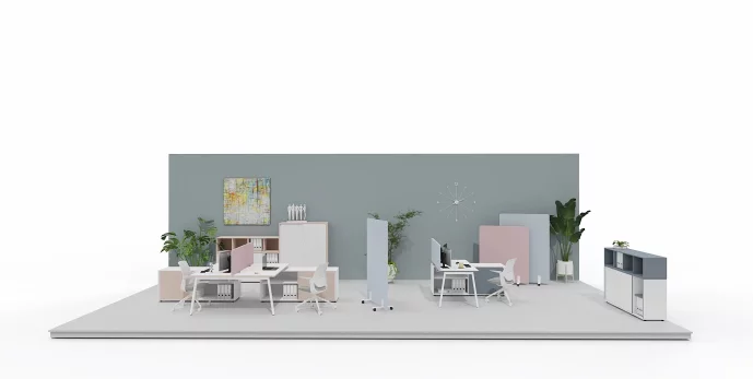
Subdued shades of warm beige, cool blue-gray, and light gray give the individual work zone a friendly, light character. The harmonious combination of these colors brings calm and supports focus. Delicate, soft finishes highlight user comfort, while natural accents—such as plants—add freshness and balance. This is a space that encourages quiet work while providing a sense of an aesthetically pleasing environment and visual harmony.

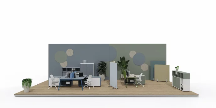
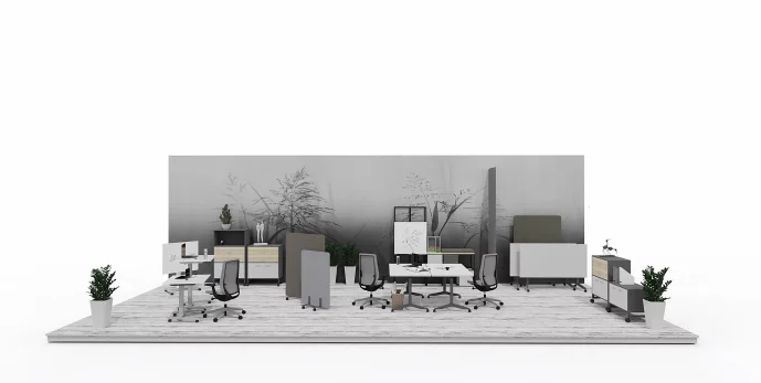
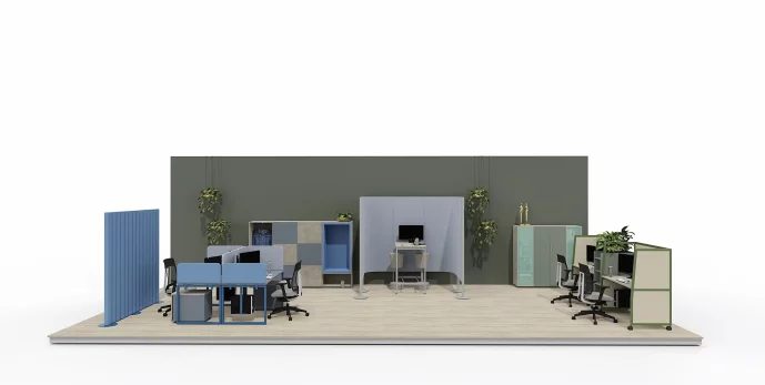
The new version of the individual work zone is based on natural, balanced colors. Muted green, cool blue, and delicate beige create a harmonious backdrop that does not distract but supports focus and inner calm. These shades are drawn from nature—they evoke the forest, rock, and sky—which brings calm and stability into the interior. Additionally, greenery and textures referencing natural materials strengthen the impression of a friendly and comfortable workspace.

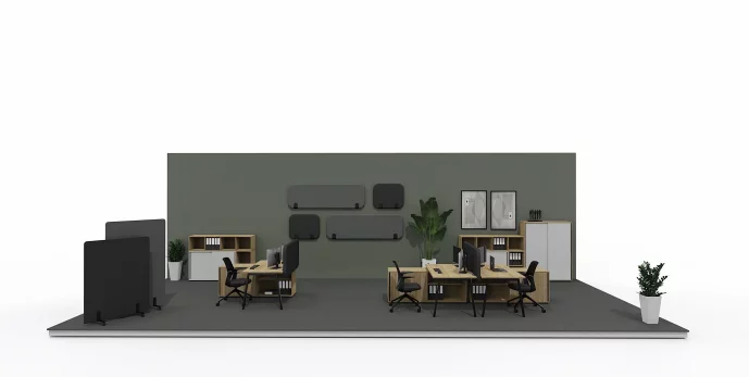
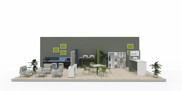
A dark color palette brings elegance, calm, and a distinctive character to the office. The combination of deep graphite, dark wood, and muted brown creates a space with a professional, refined style. Adding lighter grays makes it possible to achieve a contrast effect that draws attention while not distracting. Such an arrangement works perfectly in individual work zones, fostering concentration and providing comfort and a cohesive aesthetic.
2. Teamwork area
Teamwork is often considered more effective than individual work. This is all due to the fact that it allows for a quick exchange of views and thoughts and a confrontation of several points of view. At the same time, it boosts creativity and increases employees’ skills. In this case, mobile and compact desks from Wariant collection will work best as they help to reorganize work room and save space. A teamwork area should also include a special drywipe board where you can easily scribble down your ideas, as well as Wariant mobile modular cabinets and mobile assistants. They make up a functional workspace.
In a shared work zone, what matters is a balance between concentration and the free exchange of ideas. Subdued green supports creativity and has a calming effect, helping maintain peace of mind even in a dynamic environment. Deep burgundy adds definition and energy to the interior, while dark wood and graphite accents create an atmosphere of elegance and professionalism. Such an arrangement positively affects the team’s well-being—and that translates into better collaboration and higher efficiency.

In a shared work zone, what matters is a balance between concentration and the free exchange of ideas. Subdued green supports creativity and has a calming effect, helping maintain peace of mind even in a dynamic environment. Deep burgundy adds definition and energy to the interior, while dark wood and graphite accents create an atmosphere of elegance and professionalism. Such an arrangement positively affects the team’s well-being—and that translates into better collaboration and higher efficiency.
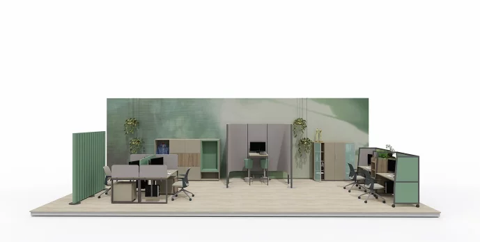
Natural simplicity supports everyday collaboration. A space designed in shades of white, muted green, and dark wood creates a calm yet modern backdrop for joint work. Plants and natural textures add lightness and freshness, building an atmosphere of trust and comfort. It’s a place where it’s easier to focus while also easily initiating dialogue and collaborating with the team.

Natural simplicity supports everyday collaboration. A space designed in shades of white, muted green, and dark wood creates a calm yet modern backdrop for joint work. Plants and natural textures add lightness and freshness, building an atmosphere of trust and comfort. It’s a place where it’s easier to focus while also easily initiating dialogue and collaborating with the team.

Varied shades of gray create an atmosphere of calm and concentration. They help quiet emotions and make it easier to focus on the task. Thanks to their neutrality, grays do not dominate the space but organize it and support effective collaboration. Ideal for zones where clarity of thought and good organization matter.

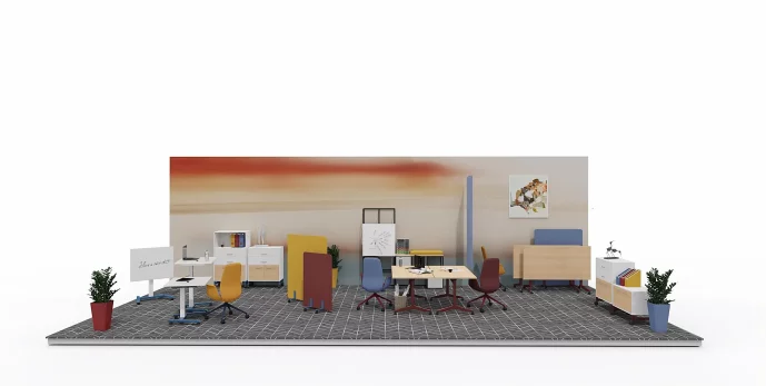
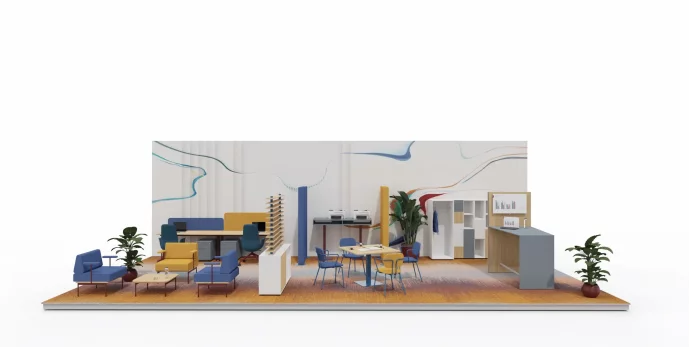
A vibrant color palette brings energy and sparks creativity. A warm wood tone is paired here with intense mustard, denim blue, and deep burgundy, creating a composition that is dynamic yet harmonious. This is a proposal for teams that value a creative work environment and need a space that supports engagement and collaboration.

3. Focused work area
Nowadays, plenty of people are struggling to concentrate. We are surrounded by various distractors and sounds and, as a result, our productivity and focus drop. At MARO, we face these troubles and offer a wide variety of solutions, such as Wariant mobile desks with high and low partitions, which allow for different types of separation. Their upholstered side panels additionally soundproof and increase the comfort of work. Aura shelf units, on the other hand, visually separate the space.
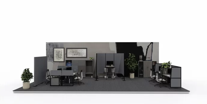
In a focus zone, silence is paramount—both literal and visual. A dark, muted color palette creates an atmosphere of seclusion and safety that supports maximum concentration. Black, graphite, and anthracite paired with a cool wood finish create a space where everyone can fully immerse themselves in work without distractions. Such an arrangement soothes the senses and supports an individual mode of working.

In a focus zone, silence is paramount—both literal and visual. A dark, muted color palette creates an atmosphere of seclusion and safety that supports maximum concentration. Black, graphite, and anthracite paired with a cool wood finish create a space where everyone can fully immerse themselves in work without distractions. Such an arrangement soothes the senses and supports an individual mode of working.
In a focus zone, the most important thing is to create an atmosphere of calm and quiet. The use of subdued blues, greens, and beiges brings delicacy and balance to the interior, without unnecessary visual stimuli. Such a color palette supports concentration, reduces tension, and allows you to fully immerse yourself in the tasks at hand.

An interior based on a pastel, subdued color palette introduces balance and calm conducive to individual work. Cool shades of blue and gray combine here with subtle beiges and olive green, creating a visually light and harmonious composition. Acoustic partitions and furniture in consistent pastel finishes emphasize the orderly character of the arrangement while warming the space and providing comfortable conditions for concentration.
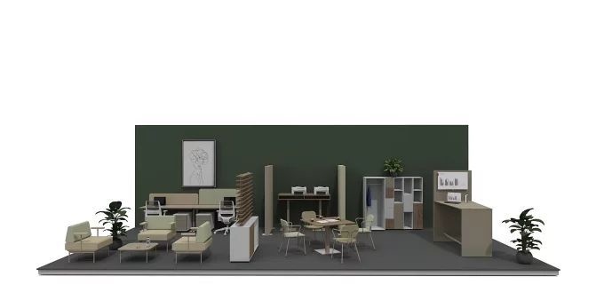
The subdued color scheme of this focus zone is based on natural beiges, grays, and shades of green. The use of a warm wood-effect finish combined with soft textiles and greenery introduces harmony and calm. This is a concept for offices where concentration and quiet are key—the balanced aesthetic translates into everyday working comfort.

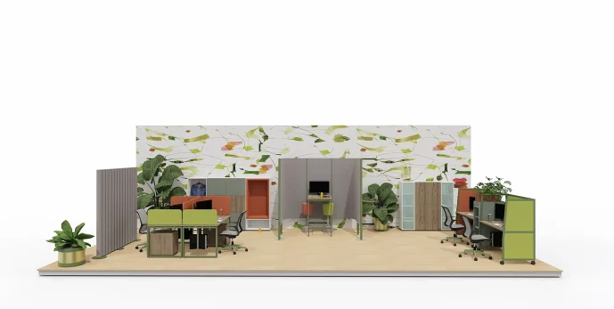
A vibrant color scheme in this zone is built on bold accents: grass green and saturated terracotta orange. Combined with pure white and a warm wood finish, they create a composition that is energetic yet cohesive. This set enlivens the space, sparks creativity, and motivates action while—thanks to the neutral base—maintaining visual order and everyday working comfort.

4. Quick meeting area
This type of space can be described as the most casual, even though it still constitutes a part of the office. It is a place suitable for chitchatting, chilling out and getting a refreshed perspective. The quick meeting area should include shared computers, where you can easily check messages, lockers for storing private belongings and a space for a printer. It's also useful to equip it with a Wariant wardrobe, where employees can keep their clothes.
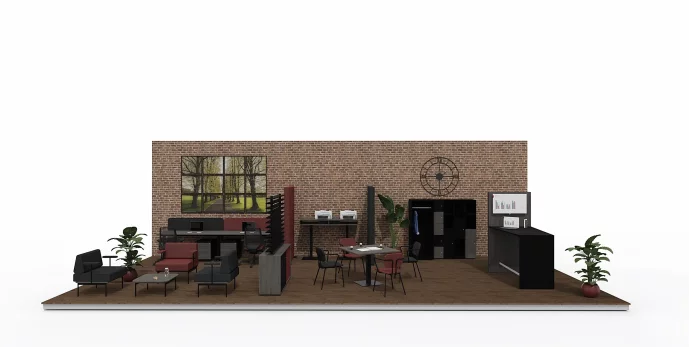
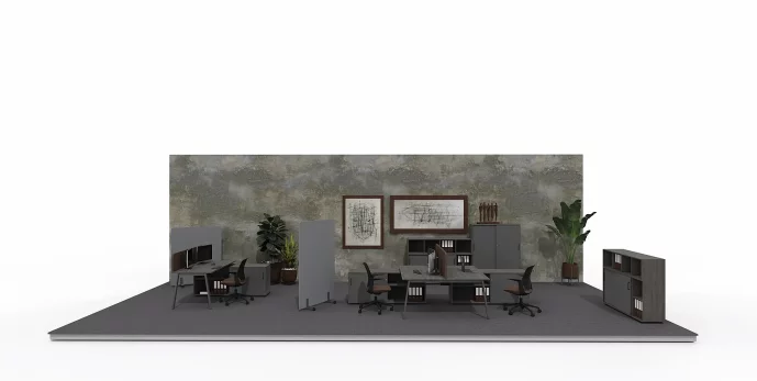
This quick-meeting zone arrangement combines elegant simplicity with functionality. The dominant dark finishes—in shades of graphite, black, and dark wood—create a professional, orderly backdrop for brief conversations and working meetings. Burgundy accents add depth and definition to the space, while a warm brick wall emphasizes the interior’s industrial character. Thanks to a well-balanced combination of colors and materials, the space supports focus and efficient information exchange—ideal for teamwork, consultations, and decisions made “here and now.”

This quick-meeting zone arrangement combines elegant simplicity with functionality. The dominant dark finishes—in shades of graphite, black, and dark wood—create a professional, orderly backdrop for brief conversations and working meetings. Burgundy accents add depth and definition to the space, while a warm brick wall emphasizes the interior’s industrial character. Thanks to a well-balanced combination of colors and materials, the space supports focus and efficient information exchange—ideal for teamwork, consultations, and decisions made “here and now.”
The new color scheme of the quick-meeting zone brings lightness and freshness to the office space. Light finishes, subdued blue, and green accents create a friendly backdrop for everyday conversations and quick information exchange. The space retains its functionality while gaining a more relaxed, modern character.

Designed with meaningful moments in mind. A delicate palette of pastel shades combines with light furniture forms to create a space ideal for short conversations and informal consultations. Friendly colors encourage openness and the free exchange of ideas, while subtle color accents enliven the interior without distracting attention. It’s a place where collaboration comes naturally.

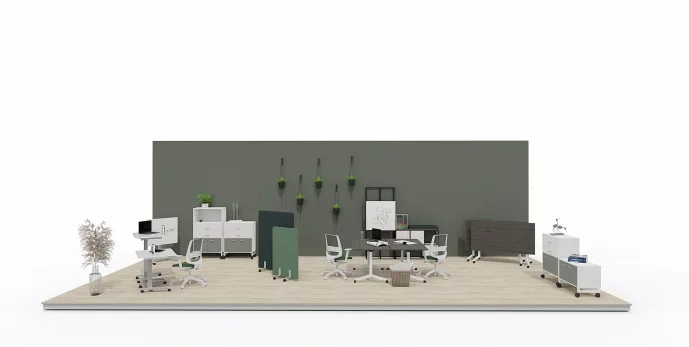
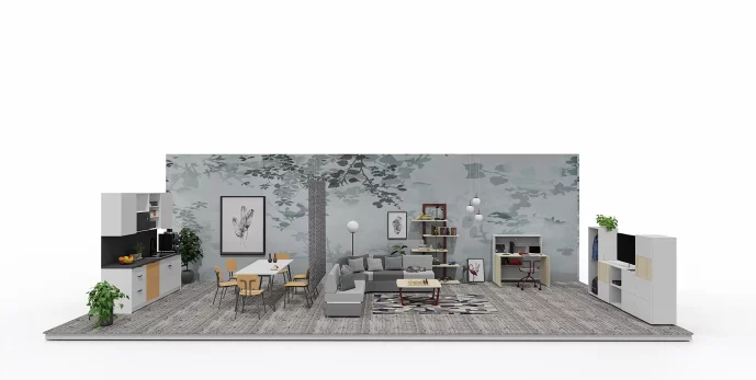
The deep green of the wall and natural wood meet here with warm shades of olive and beige, creating a tranquil, elegant, and timeless space. A subdued color palette builds an atmosphere of calm and focus, supporting a free yet constructive exchange of ideas. This is a proposal for offices where the comfort of conversation and an aesthetic in tune with the rhythm of nature matter.

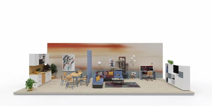
The combination of intense blue with warm yellow and natural wood creates a space that supports energetic exchange of ideas and efficient communication. The vibrant color scheme stimulates attention and makes it easier to focus on short-term tasks, while strong contrasts help define clear zones in an open office. This composition is designed with ad hoc meetings in mind—it supports quick decisions, mobilizes action, and shortens the distance between coworkers.

5. Home Office Zone
This is a space designed for remote or hybrid work, where the comfort of a home interior meets the functionality of an office. It fosters focus while allowing you to feel the ease and comfort that come from working in a familiar, friendly environment. It is important here to create conditions that enable both the individual completion of tasks and a quick transition to online meetings or project work. A properly planned Home Office zone supports concentration, day-to-day organization, and efficiency while also maintaining a sense of balance between responsibilities and moments of rest.
Home Office Zone in the new color scheme is a proposal for people working from home who value calm, order, and an aesthetic conducive to focus. The combination of gray-green fronts, light worktops, and dark wood creates a harmonious, cozy backdrop for everyday work. The subdued color palette helps reduce stimuli and helps mentally separate professional duties from the private space. It is a functional, discreet solution that fits perfectly into the rhythm of home life.

Home Office Zone in the new color scheme is a proposal for people working from home who value calm, order, and an aesthetic conducive to focus. The combination of gray-green fronts, light worktops, and dark wood creates a harmonious, cozy backdrop for everyday work. The subdued color palette helps reduce stimuli and helps mentally separate professional duties from the private space. It is a functional, discreet solution that fits perfectly into the rhythm of home life.
The Home Office zone in a subdued palette is a harmonious combination of matte white, subtle beige, warm natural-toned wood, and deep chocolate brown. This set of colors creates a calm, elegant backdrop that supports concentration while also bringing a cozy character to the interior. Light, neutral colors brighten the space, while a dark brown accent adds depth and definition, highlighting selected furnishings.

The combination of subdued grays with natural wood tones creates a harmonious work space conducive to concentration. A light wood finish introduces lightness, while its warmer counterpart adds coziness. The whole is complemented by accents in light and graphite gray, which give the arrangement elegance and coherence. It’s an ideal set-up for a home office, where both comfort and aesthetics matter.

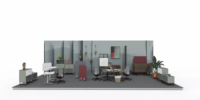
A combination of energy and harmony—this arrangement combines neutral, matte gray with a deep wine-red accent and a muted shade of blue. The whole is warmed by a warm wood finish in a natural tone, giving the interior coziness and balance. This color combination brings dynamism and character while at the same time fostering focus and creative work. An ideal solution for a space where the home office becomes an inspiring part of everyday life.

6. Coffee & Lunch Time Zone
This is a place where employees can step away from their daily duties, relax, and recharge for the rest of the day. It provides a space that fosters relationship-building and the exchange of ideas in a less formal atmosphere. Meetings over coffee or a shared meal help integrate the team and improve communication, while a short break from work benefits creativity and well-being. A properly planned Coffee & Lunch Time zone encourages a brief rest while supporting the company’s organizational culture and a sense of community among employees.
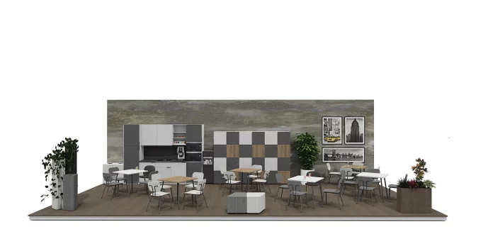
An interior kept in a subdued, elegant color palette dominated by shades of gray and graphite, complemented by a warm, natural wood finish as an accent. Green potted plants warm the composition, adding freshness and a friendly character to the space. This combination of colors is conducive both to moments of relaxation over coffee and to calm lunchtime meetings.

An interior kept in a subdued, elegant color palette dominated by shades of gray and graphite, complemented by a warm, natural wood finish as an accent. Green potted plants warm the composition, adding freshness and a friendly character to the space. This combination of colors is conducive both to moments of relaxation over coffee and to calm lunchtime meetings.
The combination of light beige, matte gray, and muted blue creates a subtle, harmonious space ideal for relaxation and meetings. The warm tone of natural wood balances the cooler shades, and plants add freshness and enliven the arrangement. Thanks to the subdued color palette, the interior is cozy yet modern and full of calm.

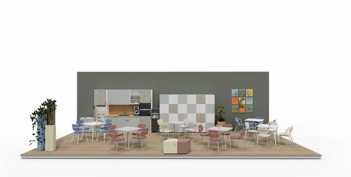
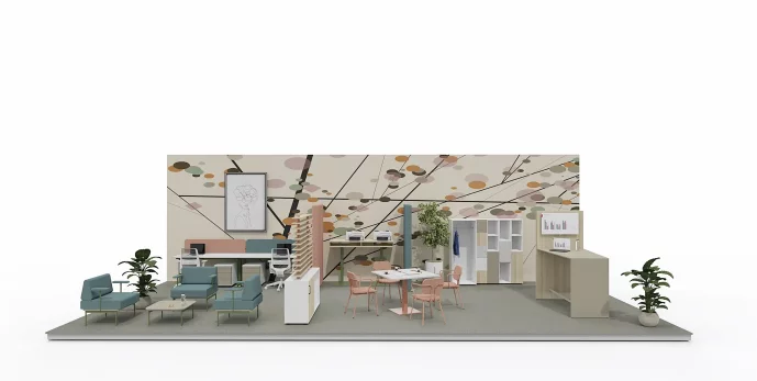
In the design of the Coffee & Lunch Time zone, light wood warms the interior and gives it a friendly, natural character that supports relaxation during breaks. Beige brings softness and cohesion, tying together all elements of the arrangement, while concrete gray adds modernity and a slightly industrial feel. An accent in the form of a pink-burgundy finish enlivens the whole, introducing energy and a subtle distinguishing element to this space. As a result, the zone becomes both comfortable and visually interesting—encouraging short meetings, integration, and a break from work.

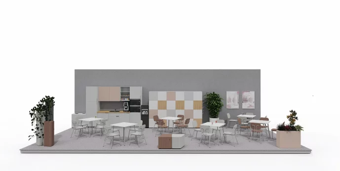
In the Coffee & Lunch Time zone, four carefully selected finishes are combined to create a harmonious, subdued space conducive to relaxation and meetings. Light gray gives the whole a modern lightness and serves as a neutral backdrop for the other elements. Light wood warms the arrangement, introducing a natural, friendly accent. Brown with a hint of burgundy adds depth and elegance, subtly breaking the pastel base. Powder pink brings softness and a delicate color accent, highlighting the friendly character of the place. The combination of these colors creates a cohesive composition that balances functionality with aesthetics.

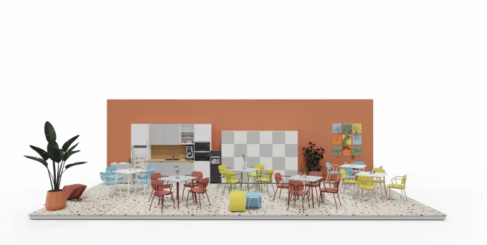
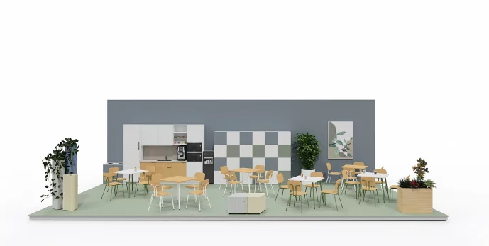
An energetic space that supports integration and recharging during the day. The arrangement combines intense, cheerful colors—light blue and vivid yellow—tempered by neutral grays in two tones. The palette is complemented by subtle accents of plant green, which add freshness to the interior. This combination creates a positive atmosphere, stimulates creativity, and encourages spending time together—both during coffee breaks and informal team meetings.